RESILIENT RX
Branding | Collateral
Resilient RX is a physiotherapy practice specialising in working with high-level athletes and patients with a more active lifestyle.
When Tony and I started working together, he was in the process of setting up his own physiotherapy practice. His unique selling point was providing more specialised and in-depth care than the larger physiotherapy practices do. The main focus behind his business was helping his patients to move away from their difficulty or pain and get back to leading the full active lives they once did and beyond – this is where the extension ‘Rx’ (a medical prescription) originates.
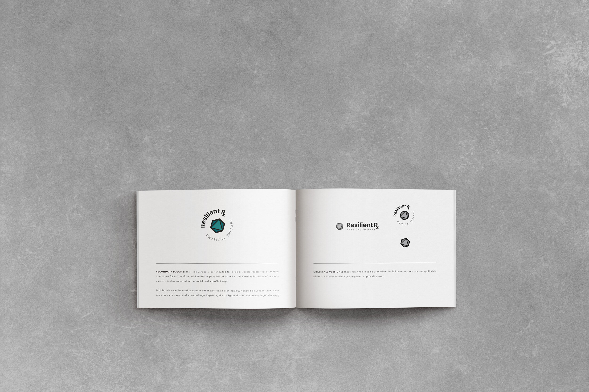
We worked on the usuals – the strategy, logo set, typography and colour palette first. Once we had the strategy in place, we were able to pinpoint the right elements to match the essence of his brand. In terms of his logo, we've opted for typography and symbols that represent healing, care and endurance aspects. The colour chosen was a mix of green and blue – representing healing and trust. The yellow accent colour added a splash of positivity as well, and the neutrals balanced the whole palette. The final visual identity appeals to Tony's unisex audience and evokes trust and professionalism. After the brand identity was finished, Tony decided to add some business cards as well.
You can find elements of the finished project below and on his website at www.resilientrxpt.com. If you’re in the New Jersey area and are in need of a good physiotherapist, this high-quality practice is definitely one to consider.
“Katarina from the beginning stood out compared to others that I have worked with in the past. Her work was very thorough, professional, timely and creative. What I liked most was that her opinions were honest, respectful and in the best interest of my company/project rather than just trying to please me in order to complete the project. I couldn't ask for a better person for my business brand design and will absolutely continue using and recommending her in the future.”
— RESILIENT RX —


I always keep an eye on how my previous clients’ businesses are doing — and seeing the branding in real-life applications (below) is extra rewarding. After visiting the website quite sometime after we finished working together, I can see that the business is thriving and that our project fulfilled its purpose.


*All design above except for the web design is done by me (all website images used are from www.resilientrxpt.com)
You can view my packages here.
To see the rest of my work click below.